HUDSON YARDS
Creating a 0-1 Wayfinding Experience for NYC's Newest Neighborhood
The Challenge
Hudson Yards represented an unprecedented urban development challenge: a completely new neighborhood built from scratch, containing residential, office, cultural, hospitality, and retail spaces across multiple buildings in Midtown Manhattan. With no existing navigation patterns or user familiarity, visitors needed comprehensive wayfinding support that could serve diverse user types—from residents and office workers to tourists and shoppers—while driving traffic to businesses and experiences throughout the complex.
Timeline
2019
Role
Lead Product Designer
Team
Visual designer, PM, Dev
Impact
5,000 uses in the first day
Continues to serve 125,000 visitors pers day
My Approach
Research Foundation - I conducted extensive user research across all Hudson Yards visitor types to understand their diverse navigation needs and behaviors. Through observational studies and interviews I identified key moments where strategic intervention could improve experience and drive business outcomes.
Analysis - The core challenge was designing for complete unfamiliarity—users had no mental model of this space. I needed to create an intuitive system that would work for first-time tourists, daily commuters, and residents, while supporting the business goal of directing traffic to retail and cultural spaces.
Design Strategy - I developed a contextual information architecture that would provide immediate orientation while offering progressive disclosure of detailed navigation and business information. The strategy balanced quick wayfinding needs with discovery opportunities for Hudson Yards' diverse offerings.
Product Development: A Comprehensive Wayfinding Ecosystem
Launching navigation infrastructure for an entire neighborhood
The Research Insight - User research revealed that successful wayfinding in complex developments requires not just directions, but the contextual understanding of a space.
Strategic Design Solution - I designed a comprehensive digital wayfinding system optimized for diverse user needs and accessibility.
Universal Design Approach
Created interface elements strategically positioned for users of any height or mobility needs
Designed touch targets and visual hierarchy for intuitive finger navigation
Ensured wheelchair accessibility throughout the interaction design


Contextual Information Architecture
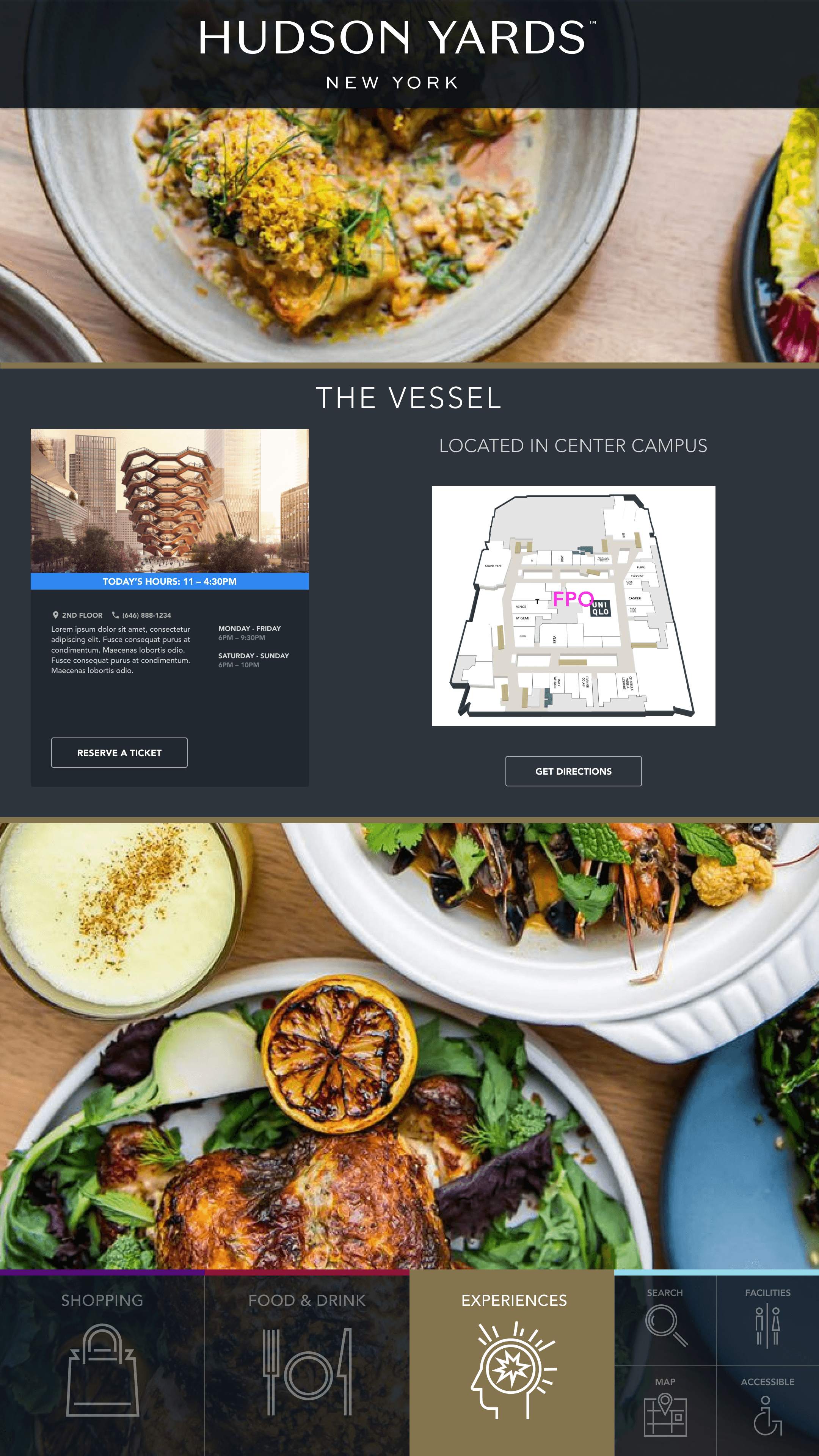
Developed progressive disclosure system: immediate orientation → detailed navigation → business discovery
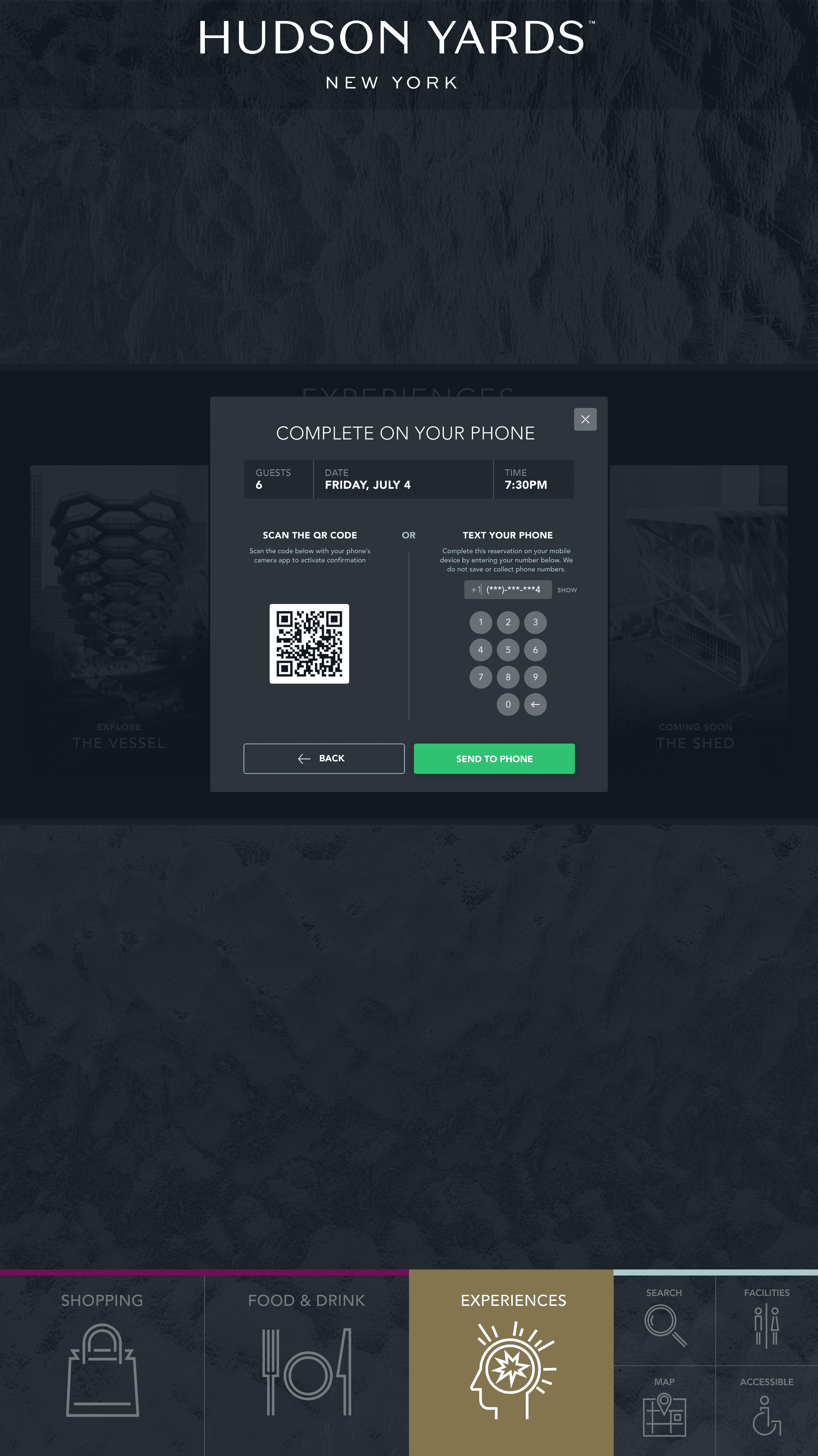
Integrated QR code functionality for seamless mobile information transfer
Created dynamic content system working in concert with other digital and static signage


Diverse User Experience Design
Designed flexible interface accommodating residents, workers, tourists, and shoppers
Built contextual navigation that adapts based on kiosk location throughout campus

Impact & Results
Immediate Market Success - The kiosk system launched successfully with the opening of the retail center and demonstrated immediate user adoption and business impact.
Usage Metrics
Day one success: Over 5,000 users on first day of operation
Sustained engagement: Continues serving 125,000 daily visitors to Hudson Yards
Business impact: Successfully drives traffic and sales for campus businesses and experiences
Key Takeaways
This project demonstrates how 0-1 product design can shape entire neighborhoods. By conducting comprehensive user research and creating strategic design solutions that serve diverse needs, I launched a navigation system that continues to serve hundreds of thousands of daily users while supporting business success across an entire urban development.
Cross-Functional Leadership - I led complete product development from research through implementation, managing a visual designer and an engineer to ensure design vision execution while meeting technical and business requirements.
Urban Planning Integration - I successfully integrated digital wayfinding with broader Hudson Yards infrastructure, creating a cohesive navigation ecosystem that elevates the entire neighborhood experience.
Scalable Design System - I developed a wayfinding framework that accommodates campus expansion and evolving business needs while maintaining consistent user experience.
